
Digital Modernization of the Appraisal Process
[The real name of the company is modified for confidential purposes]
Overview
ProStarQC is a ProStar-built software that provides experiences for appraisal needs including completing appraisal review through Quality Control Rules Engine. ProStar suite of valuation products and appraisal services are made to manage entire appraisal process from start to finish, providing residential and commercial products nationwide.
Problem
We wanted to understand what problems ProStarQC is facing and how those problems affect their business. Meeting with their CEO, CFO, Director of Product Development, Chief Technology Officer, and other team members, we agreed that the business is currently facing 4 main problems:
- Speed. The current software wasn’t fast enough which affected not only everyone’s performance results but also resulted in additional fees.
- Loss of business. If loans are not closed in time there are additional fees associated with it. In the worst case scenario the business can be lost if the appraisal doesn’t come through in time.
- Using a third-party software which results in connecting to multiple APIs.
- Manual labor. For example, when an appraiser needs to be assigned, the team member has to call and manually assign. First, it really affects turnaround time. Second, negotiation doesn’t happen during the auto-assign process.

Research and Discovery
Interviews and workshops
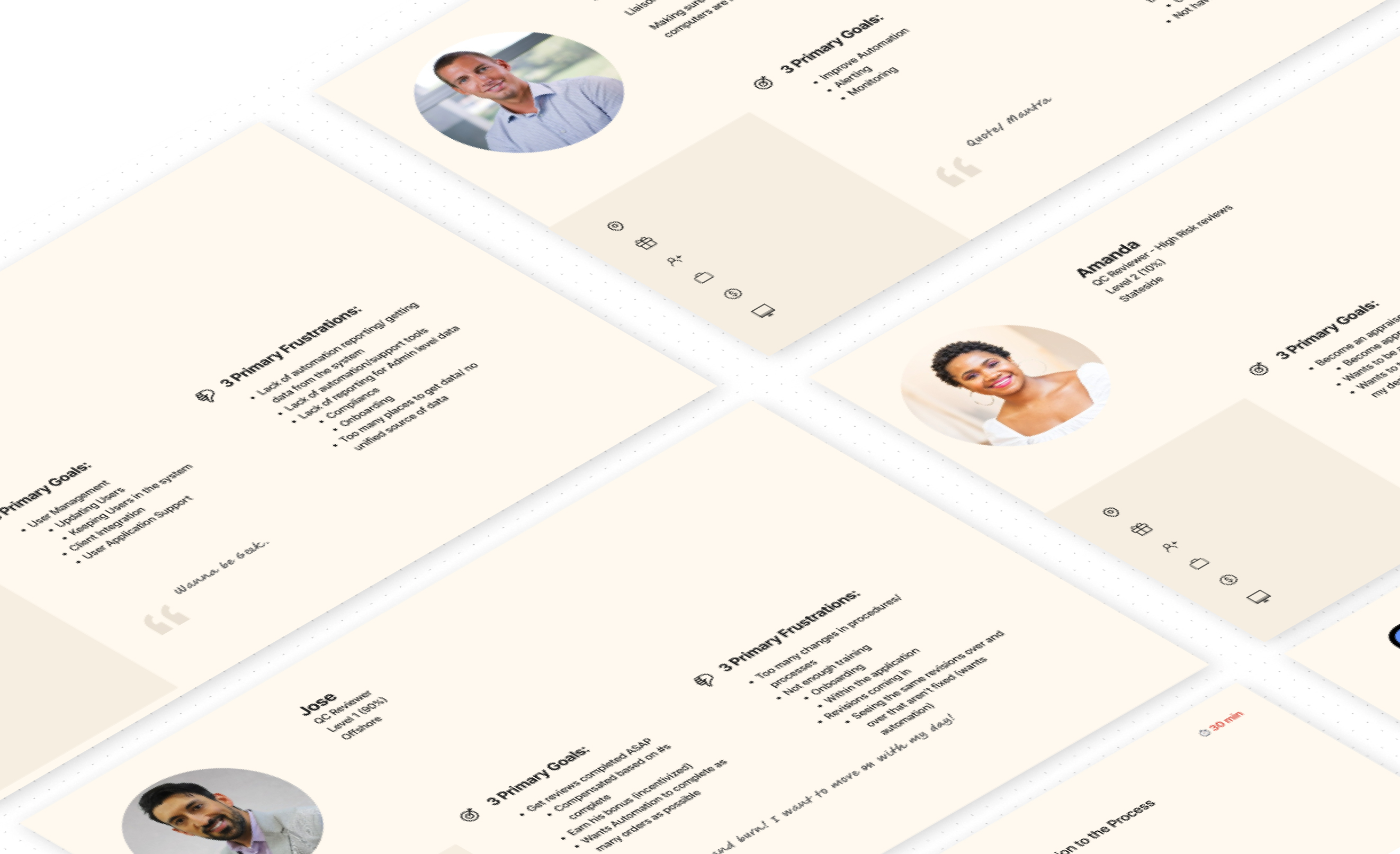
During 2 days online workshops, we discussed the client’s business goals and objectives, we went through their current reviewing processes, reviewed their current technology, went through in-depth persona creation, and tried to understand users’ frustrations and pain points. The notes, flows, diagrams, and charts were captured through whiteboarding exercises in FigJam.
User flow examples:

Data analysis
We analyzed the performance of the current online journey in order to dig deeper into the performance metrics. Working together with the Director of Product Development, we wanted to see where the major pain points are.
Key takeaways:
- Very high revision request rate which ideally needs to be reduced from 66% to 15% through automation
- High revision request rate from underwriting (lenders) which is currently around 28%
- Very long Cycle Time from initial request to delivering the report which is currently at 7 days
Target KPIs
15 min
APPRAISER
ASSIGNMENT TIME
4 hours
APPRAISER
ACCEPTANCE TIME
5 days
CYCLE TIME
15%
REVISION RATE
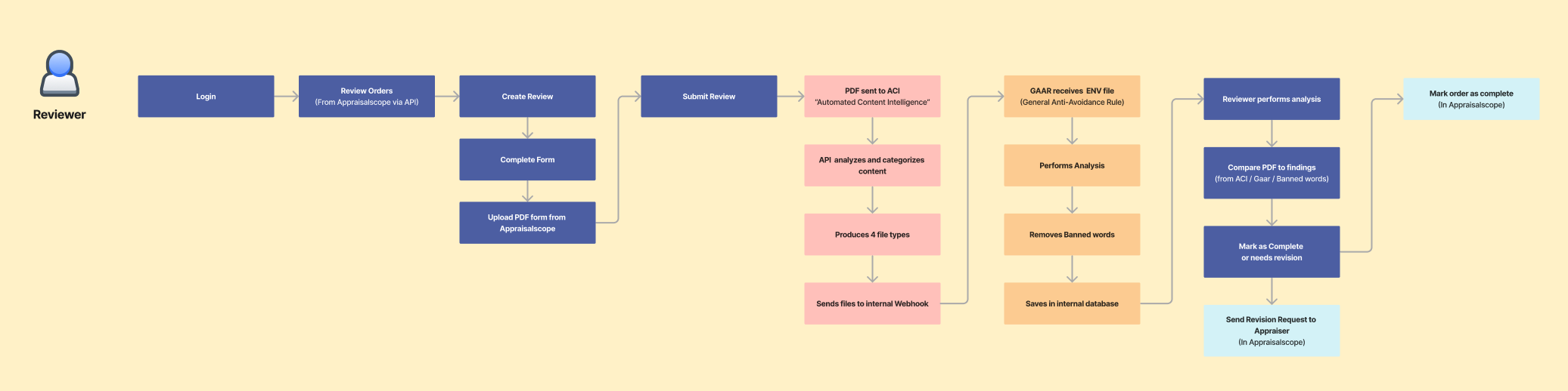
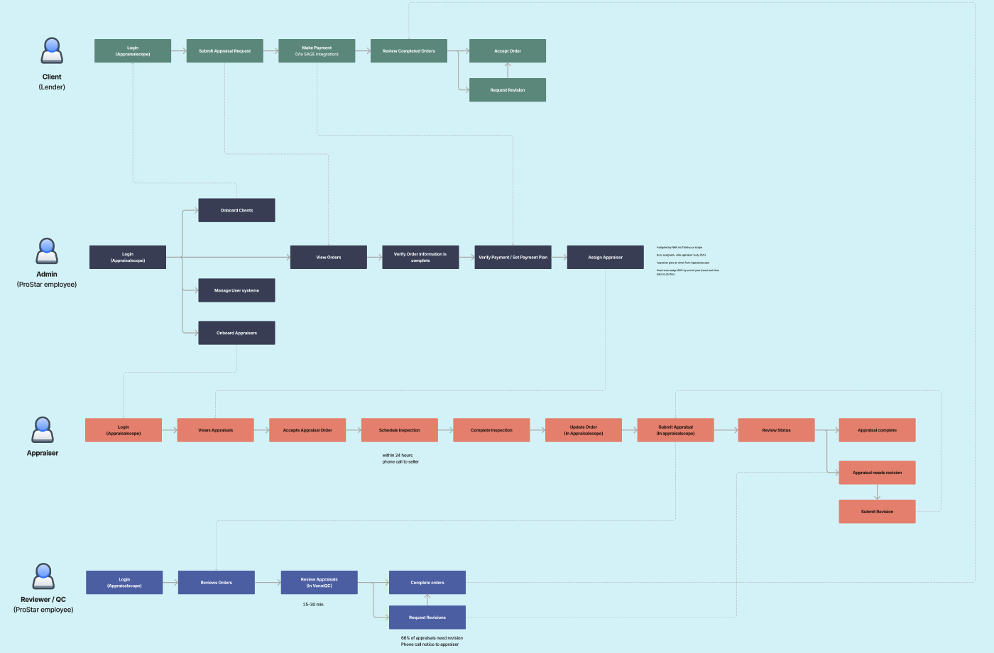
User Journey
Our next step was to revisit the customer journey / user flows created during 2 days workshops to better reflect the research, insights, and discuss a new version reflecting new steps with system’s automation logic.
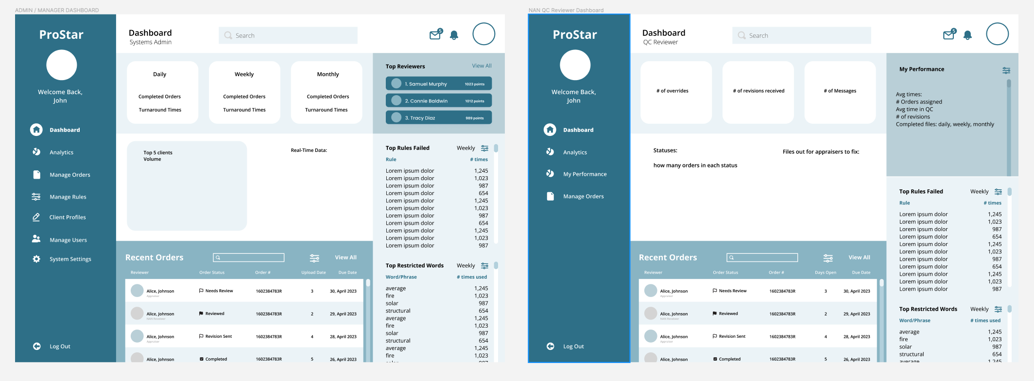
In the following process, we mainly focused on two previously-created personas: Systems Admin and QC Reviewer.
After we confirmed the flows, we identified an important Features List for both Admin and QC Reviewer dashboards through additional interviews and questionnaires.


Sketches and Low-Fidelity Wireframes
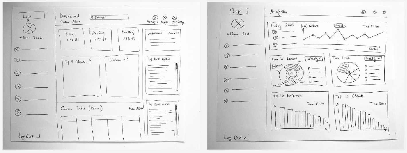
After all workshops were completed and we filtered through all information provided by the client, we went forward to actual making of a solution. Our design started with sketches and low-fidelity wireframes.
A lot of initial layout concepts were done through pen-and-paper and magic pencil on iPad sketching. All the following steps from low-fidelity wireframing to component library and high-fidelity prototyping were done using Figma.
Medium-Fidelity Wireframes and User Testing
With the client, we had weekly Design Review meetings where our team presented new wireframes and discussed new features and flows.
After all feedback was implemented, we added fidelity and took these wireframes to their user groups. The medium fidelity designs allowed us to conduct some unmoderated user testing. We quickly gathered some important feedback documenting everything in Confluence and implementing it on each new version of our designs.
Key takeaways:
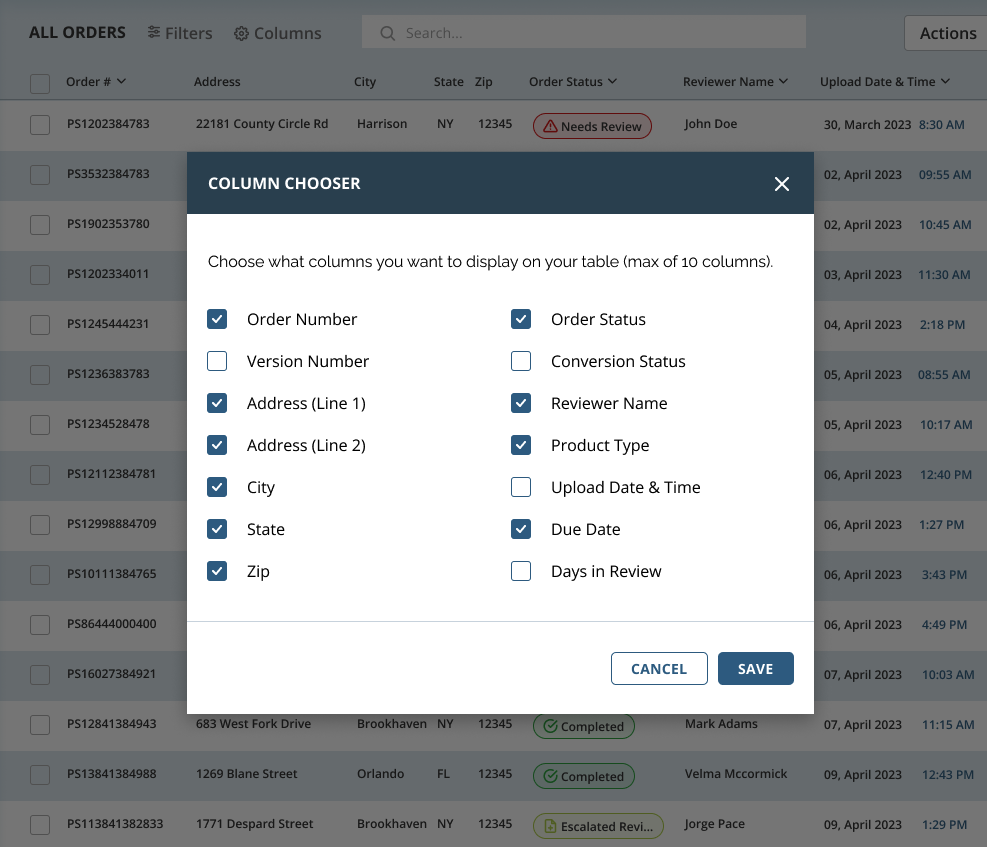
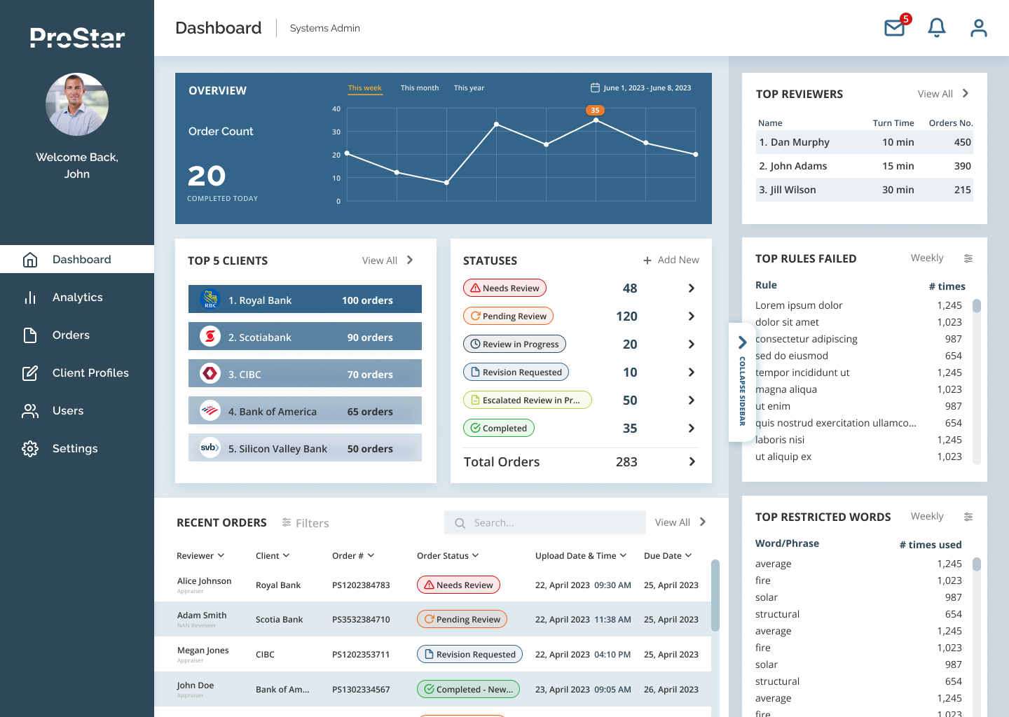
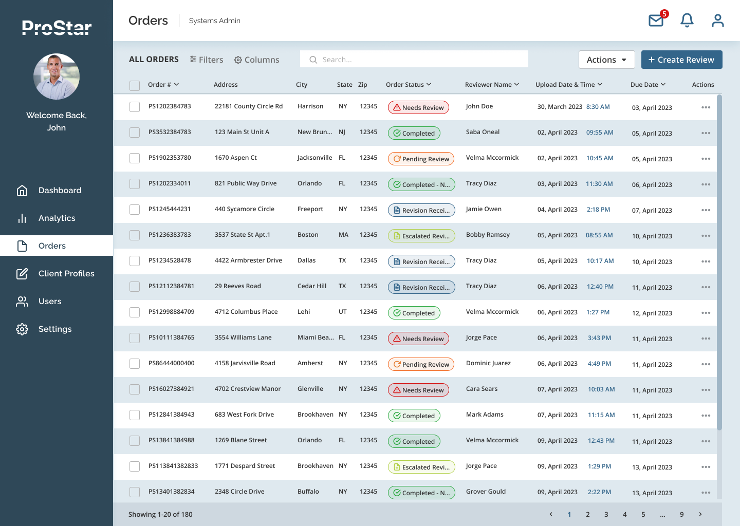
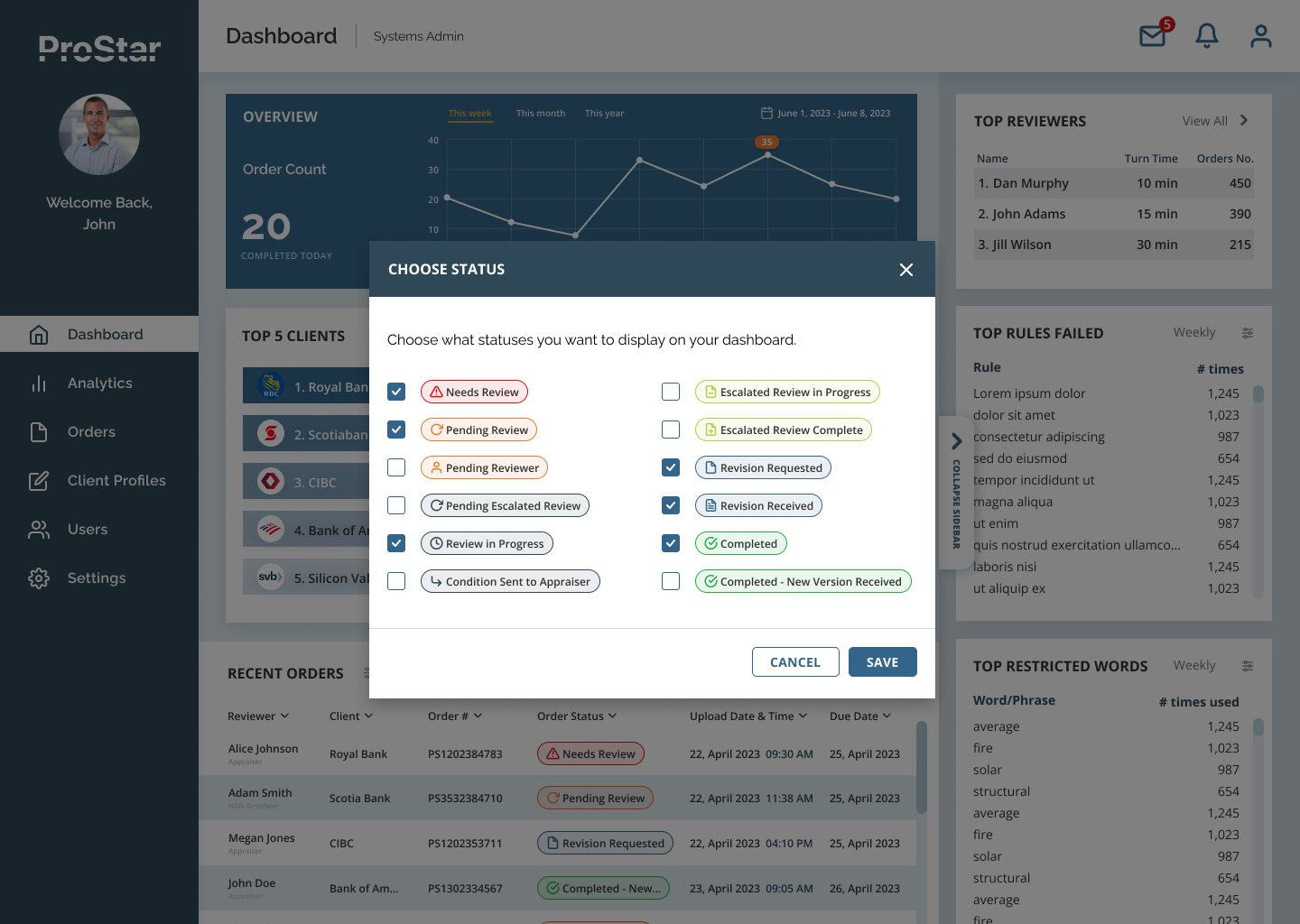
- Users want to see different data sets depending on the tasks they currently have. Therefore users should be able to customize the table themselves and add/remove statuses to be displayed on the Dashboard. In order to achieve this, on top of common sort/filter functionality, we introduced a concept of a Column Chooser for complex data tables (for example, on Orders screens) and Status Chooser in Statuses widget on the Overview Dashboard.

- QC Reviewers in particular were very much interested in seeing more of a Progression Dynamic where users see and feel forward movement with each step, always with a clear view of a completion or celebration. Also, it was important for them to see themselves as improving and surpassing others.Therefore, we decided to introduce some exciting gamification elements such as Performance Comparison charts, Goal Tracking (users can compete with their own results and track their performance), and Leaderboards (users can compete with other reviewers). Our users were especially pleased to see these additions which would make their daily routine way more fun.
- Order View screens should have more guidance for the new users and cues identifying the current progress or completion of steps. To make our experience more intuitive without cluttering our designs, we added tooltips, progress meter, and system highlights (our software would highlight an area of the screen where action needs to be taken).

High-Fidelity Wireframes
Testing the first iteration of our designs revealed that there were still some important features that needed to be considered. After a few rounds of feedback from user, we put together a clickable prototype in Figma for both QC Reviewer and Admin dashboards. We added fidelity based on provided brand guidelines with addition of neutral UI palette and some additional status and accent colors.
Below in a scrollable carousel, there are a few static screens for Admin Dashboard, as well as a recorded prototype view (YouTube embed) with some interactions shown.


Hand-off to Developers
We were lucky that by the time we were ready to hand off our work to developers, Figma already launched its famous </> Dev mode so we did not have to use Zeplin extension as we did with previous projects. With the new Figma Dev mode, everyone can navigate designed screens at the development level.
Figma allows devs to build faster with the customizable code snippets feature included in Dev mode. They can even compare new design changes with previous versions. Devs can click at any object on the canvas while in Dev Mode to populate the Code section in the inspect panel.
Even though developers and engineers were always the part of our conversations with the client in our Design Review sessions, we still made sure we followed the best practices and set the files up for better collaboration.
- We organized files with sections for better organization and easier navigation
- We named pages descriptively to let others know what’s ready for development
- We created a single page with instances of all our components
- We followed name conventions for screens and added meaningful descriptions to components
