Investment Advisor’s Online Reporting Dashboard
[The real name of the company is modified for confidential purposes]
Overview
Duration: 20 weeks
Role: Lead UI/UX Designer
ABC Investing is a trusted investment and performance reporting company that allows RIAs (registered investment advisors) to create on-demand custom financial reports for their clients and reflects client’s financial plans. ABC Investing strives to help wealth management companies focus on what they do best by becoming their performance measurement partner.
The goal of this project was to define the user experience for the new market and optimize the experience for the current user base. ABC Investing engaged our team to grow its core business with a focus on a modern technology tools and new market opportunities.

Problem
- Absence of meaningful documentation, project management software, dedicated code testing team, etc.
- Too much of a manual labor which affects productivity, employee experience and overall business goals
- Numerous single points of failure
- Lack of application and client data security
- Lack of report customization tools and many current technology limitations
- Lack of user-friendly tools and interface
- Poor user engagement
Main Goals
- Define the user experience for the new market and optimize the experience for the current base
- Plan for adoption of new processes and training for resources
Platform Opportunities
- System code optimization
- Transition to a cloud architecture
- Increase security through MFA and SSO flows
- UI/UX optimization

Research and Discovery
Interviews and Workshops
After the first immediate step with MFA/SSO implementation to their current platform was completed in order to improve security, we started tackling UI/UX modernization challenges.
The LPA (Lean Product Accelerator) session is a collaborative process designed to accelerate concept realization, help shape the client’s vision, and provide meaningful insight and recommendations that provide a client with the building blocks for successful execution.
We started with a 2 days on-site workshops in the client’s office.
During co-creational workshops, our team had the following agenda:
- Stakeholder interviews on objectives and painpoints
- Identifying Value Promise
- Going over Customer Segmentation
- In depth user persona discovery
- Process reviews
- Measurements of success
- Ideation and brainstorming
- Goal and vision alignment
- Design thinking as its best, exploring new possibilities, generating countless ideas and considering various options moving forward
The majority of notes were documented with markers on physical whiteboards and later transformed in FigJam whiteboard with an opportunity for an entire team to collaborate and add to it.

Competitive research
Researching ABC Investing direct competitors helped us to see how their business performance reporting tools compared against others. I noticed that some competitors had a relatively pleasing interfaces but they all lacked very important functions that ABC Investing was trying to accomplish. For example, none of a competition offered a “flexible reporting interface” with an ability to customize the report or drill down to see more detailed sophisticated report data.
However, the overall UI / visual design of ABC investing’s software was way behind their competitors – this was a giant area for improvement for sure.

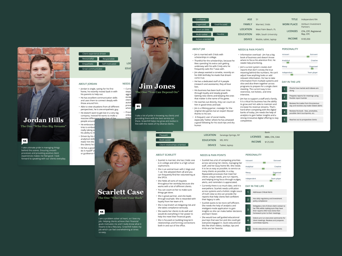
User Personas
A deep understanding of user behavior and needs makes it possible to define who a product is being created for and what is necessary or unnecessary for them from a user-centered point of view.
The reason why I took some time on in-depth user persona creation is because we wanted to build an empathy with users. Personas are not about demographics. It’s more of a combination of cognitive psychology, user-centered behavior and context-specific details. We tried to understand users needs, their paint points and frustrations, how their day in the life looks like, what are they struggling with the most, etc.
During this exercise, we created 3 personas for Registered Investment Advisor (RIA), Bank/Trust worker, and ABC Investing Customer Service Representative. From now on, we concentrated our attention only on the next highest priority market segment – RIA, represented by Jim Jones’ persona.
First Design Iterations
The next step was to define a features list for Jim’s Dashboard. This was another internal whiteboarding exercise in FigJam where everyone could collaborate, discuss, comment, and add notes.
With established features list, we started from bunch of very low-fidelity pen-on-paper sketches and “magic” pencil on iPad wireframes. At this stage, we valued quantity over ideas over quality of ideas at this stage. This was about thinking creatively and constantly validating ideas through short iterative brainstorming and internal discussions.
Then, we added some fidelity and started heavy wireframing in Figma.
High-Fidelity Wireframes and User Testing
With the client, we had two weekly sessions via Zoom: Design Review sessions where our team presented new wireframes and discussed new features; and Feedback Review sessions where our team discussed feedback implementation received by the client and asked questions.
After several rounds of feedback, we added fidelity and took these wireframes to the next level.
This phase itself required a deep understanding of the terms and visuals used by the client. We also had a subject matter expert from our team (Strategy Director who has a very deep FinTech background) who I was constantly collaborating with to get to know a lot of terminology, materials, and performance charts used by ABC Investing.
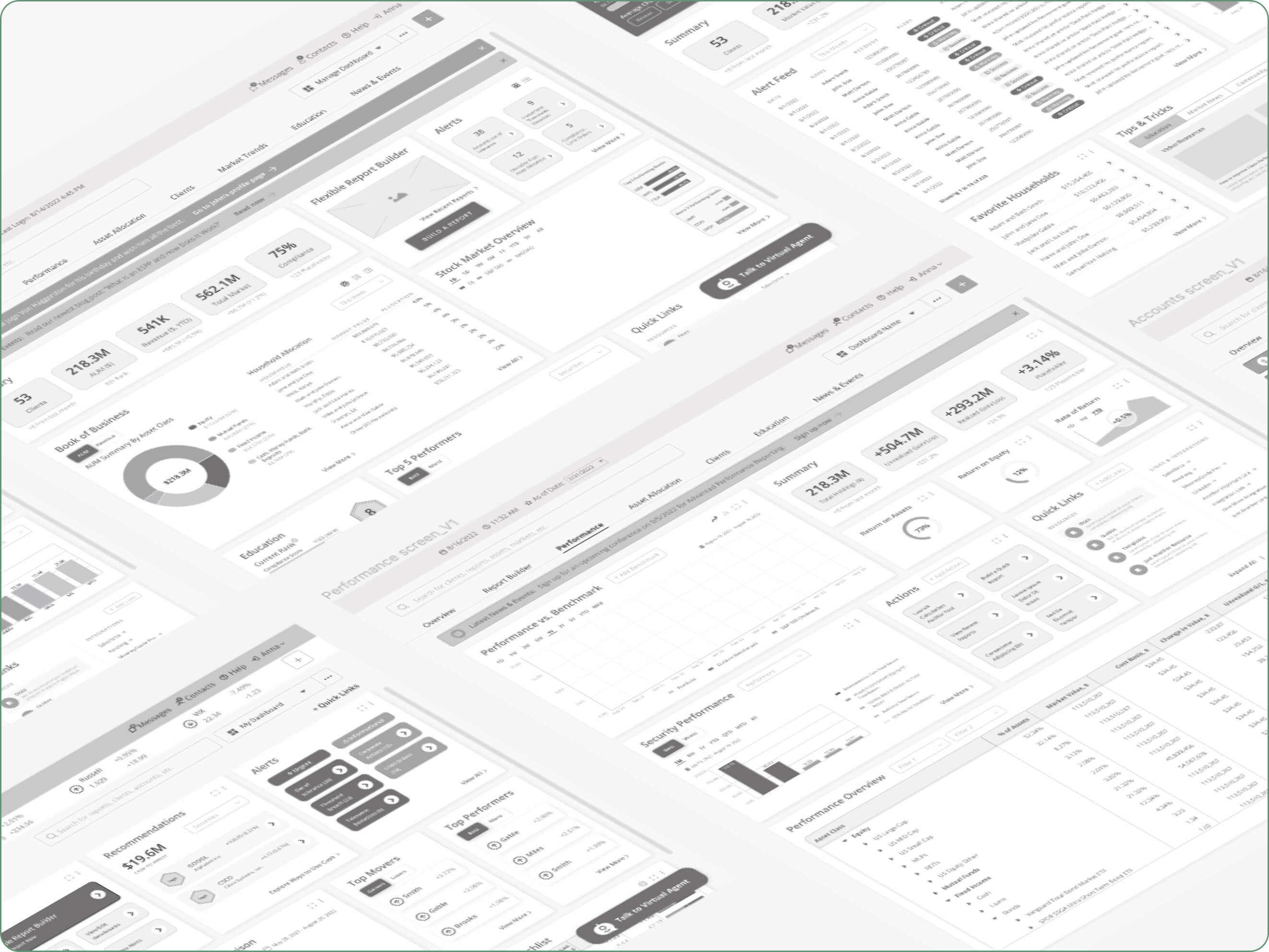
At this stage, we presented various wireframes – from the main Dashboard Overview layout to Performance, Client, Accounts, and Education screens.
Key takeaways
Data Table Customization
ABC Investing’s products serve up large quantities of data to their users, making well designed table experiences a priority.
During user sessions, we discovered that data tables need to have even more customization that we planned originally. Not only it needs to have a sorting, filtering, and well-structured Column Chooser based on group selection (by Asset. Account, Account Group, etc.) but also the following:
- Expand/collapse functionality with an accordion to expand each parent asset classification with a way to expand the rows to see more details
- Flexible table header options: ability to manipulate the order of the table header title by dragging and dropping (very exciting part!)
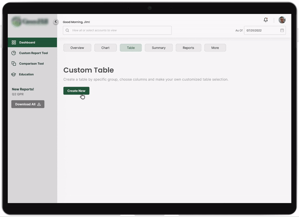
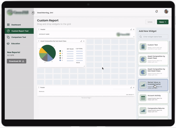
Widget Placing and Resizing in a Custom Report Tool
Users are able to drag and drop widgets from the Widget panel on the right and then they should be able to manipulate sizing and position of the widget on the report template grid component.
Post-Run Report Flow
Once the report has been generated, users should be able to preview the report and add custom notes by clicking anywhere on the report, adding Custom Note text (wysiwyg), and previewing it live in the report viewer before saving it.

Introducing some fun
Current ABC Investing’s software did not have anything associated with educating their staff and clients. And we decided to advocate for introducing gamification principles and bringing a lot of fun aspects into massive amounts of raw tables and numbers.
Some educational opportunities included introducing curriculum, badges, leaderboards, earning point and rewarding system. We created an area where people could understand that they belong to a community, they could compete with themselves and with others with a constant sense of learning and self-improvement.
We even introduced a concept of “Fantasy Investing” where ABC Investing community could sharpen their stock market skills and invite other staff to participate in a monthly games and challenges which would result in getting a real prize or becoming “the best advisor of the month”.
ABC Investing team was very interested in engaging their staff into these activities and getting their daily routine more exciting, so they definitely wanted to explore more in this area.

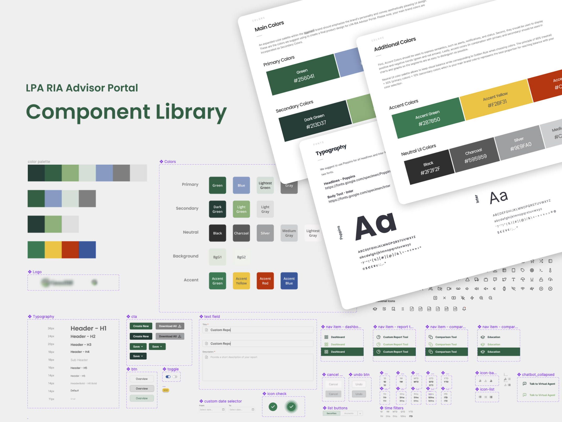
Design System and Component Library
Before putting together a master clickable prototype, I took some time to organize everything around reusable components. In order to do so, we created a Design System and suggested a new ABC Investing Style Guidelines since nothing was in place at that time.
Design System was based on Atomic Design Methodology. According to Atomic Design, all user interfaces are interconnected, hierarchical systems of components. My design model was comprised of 5 discrete levels:
- atoms (brand elements, such as color palette and fonts)
- molecules (more complex elements that consist of brand elements, such as buttons, toasts, trackers, etc.)
- elements (forms, data tables, cards, navigation elements, etc.)
- components (some basic widgets, tables, graphs, chat box, action lists, etc.)
- widgets (full widget variations made of multiple components)

Delivery and Master Prototype
The UI/UX experience we offered in this project is a technology that not only creates and runs reports, but also provides on-demand access for clients and advisors to gain valuable market insights, access data tables, analytics, and multiple financial and education tools.
Together with the client, our team established their vision and told their story. We prioritized and transformed data into valuable insights. From multiple workshops, sketches, whiteboard exercises, and user persona creations, we came all the way to next-gen reporting experience.
The final deliverable of this project was a clickable master prototype which ABC Investing team took to their user groups for testing and collecting additional feedback.
I took some time and used Figma’s native prototyping tools to add all the necessary interactions. This included buttons, links, hover effects, scrolling, dragging functionality, and so on.
I truly enjoyed this phase the most because it heightened our fidelity from static designs to interactive prototype which is easy to use and test.
After all, this prototype looks and feels just like a real app!
