


ADA Compliance Audit and UI/UX Overhaul for an eTitle Company
[The real name of the company is modified for confidential purposes]
The Close Title Solutions is a cloud-based title production company based in Lake City, FL.
The Close Title Solutions recognized the need of the user interface revamp while also paying close attention to their existing accessibility issues.
In order to determine if UIs are following Web Content Accessibility Standards (WCAG 2.1), it is necessary to follow the guidelines and conduct a thorough accessibility audit.
During this project, I performed an audit of their existing software and came up with an Excel spreadsheet which included the following:
• Color usage
• Heading structure
• Link behaviors
• Hover and focus states
• Form (errors, labels, etc.)
• Layout (consistency, responsiveness)
• Media (captions, alt text, etc.)
• Tab order
• Typography
The most important parts of the audit included:
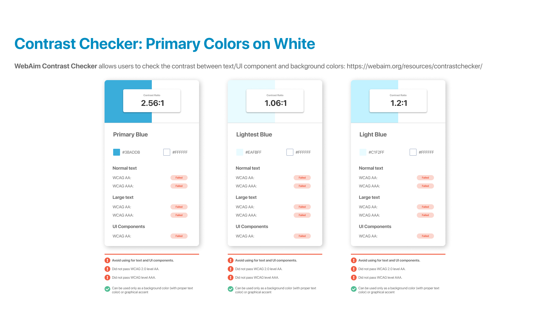
• Color contrast (sufficient contrast between text and UI components and its background)
• Visual hierarchy (UI elements have an organic relationship between them, where the most important among them stands out at first glance while the secondary and tertiary elements complete a coherent narrative map)
• UX issues (hover effects on buttons, focus states, interactions for some components, such as for example, when a user opens a list item and then goes back - does it take a user to the top of the list rather than the same spot where he/she left off?)
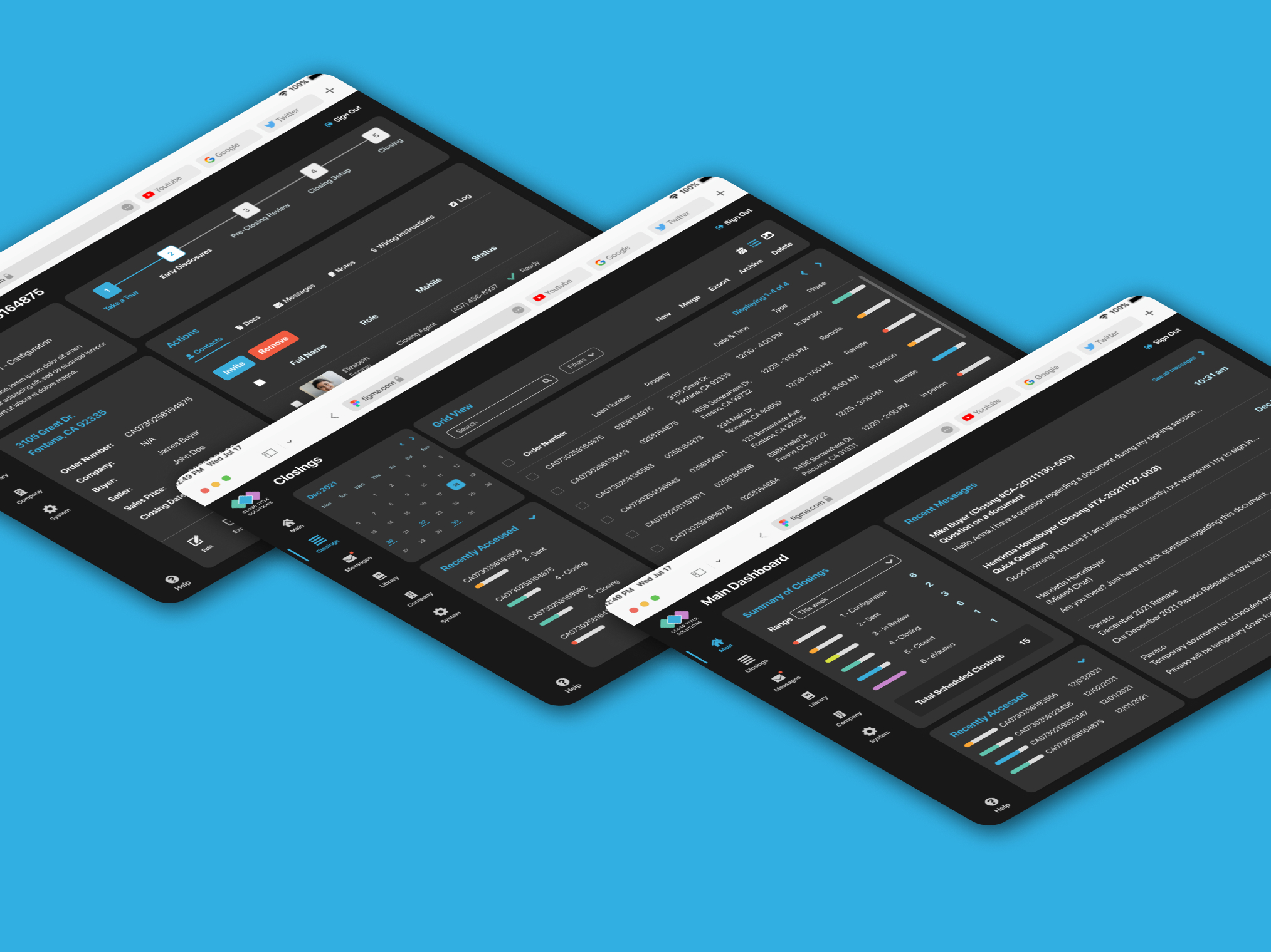
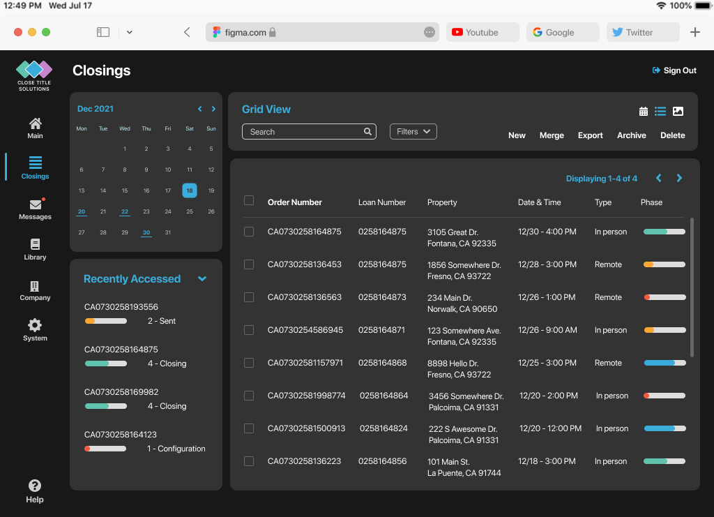
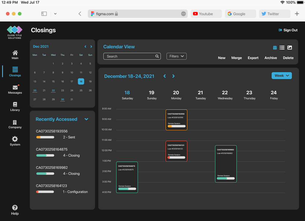
While some items were not difficult or time-consuming to fix, others required more team collaboration and decision-making involved. Color contrast became one of those items. In many instances, the Primary Blue color they used as a text against white background (and vise versa: white on blue for buttons) did not meet level AA standard. It’s easy to create contrast with dark and light hues. Consider dark text on a light backdrop or light text on a dark background. Alternatively, you can create a variety of color palettes to experiment with different color combinations. There are alternatives to choose from. However, The Close Title Solutions had a solid brand and style guidelines in place, and therefore did not want to update any of their existing primary and secondary color palettes. So the solution I offered was to introduce a dark UI for their software which would keep their brand color palette as is but increase the contrast.
While introducing a completely new UI with dark background, I tried to make sure any changes I made are not made for the novelty of the changes, even though their existing product looked and felt very outdated. I tried to understand what users were already familiar with from the product perspective and implemented only necessary changes that respected what users liked and disliked. At the final stage of this exercise, I improved the overall user experience and functionality of the product by introducing an understandable evolution with some necessary accessibility decisions.
ServicesUser Interface, User Experience