Don’t we judge books by their covers? In most cases, we probably DO. And great UI design will define whether your product succeeds or fails. For example, if you’re making a website, no matter what part of the website your visitors start with, whether it’s a home page or sub category page, the most important role of UI is it has to encourage the visitor to find out what’s beyond that first screen. The first experience is the most critical.
Expectations are first formed visually. It’s interesting that while technology and design trends constantly change, people don’t. Before you read a few pages to see if you like the book, or scroll through web pages to see if you like the website, your brain already sends the message that this might or might not be worth your time.
Therefore, any UI should purposefully answer so-called first-use questions: “What is it?”, “Is it worth experiencing?”, “Is it trustworthy?”. Once you do get users in the door, you most likely can’t confuse or frustrate them. On the other hand, users won’t come back if they don’t find their experience easy enough or user-friendly.
Appropriate UI Design enables visitors to do what they came to do, what they want to do. Every UI decision you make should provide visible evidence of value (which also reinforces UX value).
In this post, I’m going to talk about some of the timeless UI design principles which will help you to make sure your users are engaged and like what they see from the very start without yet knowing what the content is about.
- Consistency
- Alignment
- Negative Space
- Visual hierarchy
- Proximity
- Contrast
- Occasm’s razor
- Hick’s Law
- Progressive Disclosure
Consistency
I want to emphasize the importance of consistency and place it as the first one in this list. Consistency is the key of any UI design. In good UI Design, all elements are uniform. UI improves when similar elements have consistent look and function in similar way. When consistency is present in your design, people can transfer knowledge to new contexts and learn new things quickly without pain.
No matter what design you’re making, whether it’s a product, an app, or a website, consistency eliminates confusion and makes it easier for your users to navigate or use your product. Make sure you’re consistent in everything I’ll be mentioning in this article from styling, placement, and typography to alignment, use of space, proximity, balance, hierarchy, variety, repetition, etc.

Alignment
As composition is crucial in art, alignment is crucial in UI Design. Elements that have the same alignment path are perceived as one group. Alignment helps us to create a sense of unity by providing structure and connecting elements in a subtle, yet powerful way.

When you create your UI Design, be sure to take some time and align elements properly in relation to each other. Both vertical and horizontal alignment paths should be considered. Always try to be consistent with the alignment of various elements. For example, if your heading is left aligned on one page, make sure it is left-aligned on all pages.
Also, don’t forget to follow the edges of your container width. By anchoring elements in each side of the container, it’s easier to guide the eye from one element to the next.

Negative Space
Negative space, (often called white space or empty/blank space) is a space that has no content or any other elements in it. It’s important to keep an eye on negative space and use it purposefully so your design elements have some room to breathe.
My favorite example of the smartest use of negative space in logo design is FedEx logo. Such a clever use of this negative space between the last two letters form an arrow which just makes it one of the most genius designs of all times.
Read this article which describes some smart ways to use negative space in logo design.
Negative space in web and app design is not only the space in between the elements, but also margin and padding of the element itself.

Sometimes, there are reasons to keep your space blank (clarity, visual aesthetics, eye scan, etc), and it is especially important in web design. Read this article if you want to learn more about how to use negative space in web design.
Visual Hierarchy
Visual hierarchy is the key principle in composition and it defines typography, colors, space, grid, size and positions. These elements need to be defined in one central place and then used across the system you’re designing. Use the same color palette across the product. Padding and margins need to be consistent in a group of similar elements (buttons, cards, etc.). Everything should be ordered in a grid of your choice that allows the arrangement of all components in a nice and aesthetic way.

Read this article to learn more about how to capture attention with visual hierarchy.
Proximity
Objects that have a property in common, such as shape or color, are perceived as one group. But our brain also perceives objects located close to each other as one group.

This applies not only to visual design elements such as buttons, cards, posts, but also to written content, input fields, and any other layout elements.
The form on the left has input fields located far from text labels. It’s hard to connect labels with text because they are not close to each other, and separated by lots of white space. Two forms on the right have the correct proximity of the elements. Not only it eliminates the size of the form itself, but it immediately becomes more scannable.
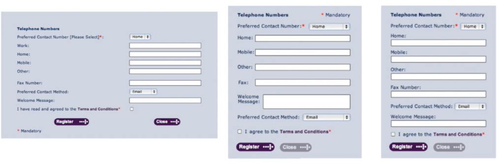
The negative space principle goes side by side with proximity. It is very important to control relations between elements by making sure you have enough negative space to separate elements but these elements are still close enough if they are parts of the same group.
Contrast
Elements with the highest contrast draw more attention and therefore can express importance. Similar to visual hierarchy, contrast creates information hierarchy.

Contrast and color use are crucial to accessibility. Users, including users with visual disabilities, must be able to perceive content on the page. To build an ADA compliant website or an app, designers must follow specific guidelines to accommodate people with visual, hearing, and mobile disabilities. Electronic Accessibility standards and best practices are established by WCAG 2.0 – Web Content Accessibility Guidelines (WCAG) 2.0. They are published by the World Wide Web Consortium’s (W3C) Web Accessibility Initiative (WAI). Read more about WCAG 2.0
Contrast ratio is a measure that defines brightness between two colors. This ratio ranges from 1:1 (e.g. white text on a white background) to 21:1 (e.g., black text on a white background).
You can use one of the following tools to check your contrast ratio:
Occam’s Razor
You can read different definitions of what Occam’s razor is related to law, science, and philosophy. In UI Design, it is actually very simple to understand. The main rule of this principle is as simple as this: The simplest solution is always best.
In design, you often hear that “less is more”. However, simplicity doesn’t mean bare minimum. It just means we have to provide clues instead of clutter. By only introducing complexity when it is necessary, we can ensure that our designs always stay UX friendly.
My favorite example of this principle is the calculator design evolution.

The idea of flat design is the result of this principle. By removing unnecessary elements (such as in this case gradients on the buttons and main screen) and simplifying layout, we get a cleaner, nicer looking design. The method of removing complexity and offering the simplest solution was applied to many modern design trends, such as flat design , black and white design, minimalism, and many other modern approaches. Read this article (which actually happens to be written by me) to see how lots and lots of modern companies, including Miles Technologies, improved their logo and branding based on the Occam’s Razor principle.
Hick’s Law
This is also very similar to Occam’s Razor principle which states that the time it takes to make a decision increases with the number and complexity of choices.
You probably already know that when most people first land on the website they don’t read the page. They scan the page. When you have huge chunks of text on the page, and they are not mixed with any visual aids, such as images, graphics, alternating backgrounds, and interactions, the chances users stay on your page are very minimal. By minimizing choices and breaking complex tasks into smaller steps you increase chances that users will find your UX way better.
The more choices users have, the longer they take to make a choice and the more likely they’ll experience information overload. In other words, Hick’s Law states that it’s not information overload – it’s a filter failure. Too many choices paralyze our thought process. You can make your UX different by making it simple.
Let’s look at mega menus. Why do we even need them? If your menus offered direct access to every link within your site, you could quickly overwhelm the visitor. If Amazon’s menus did that, it could take several hours to scroll through a menu.
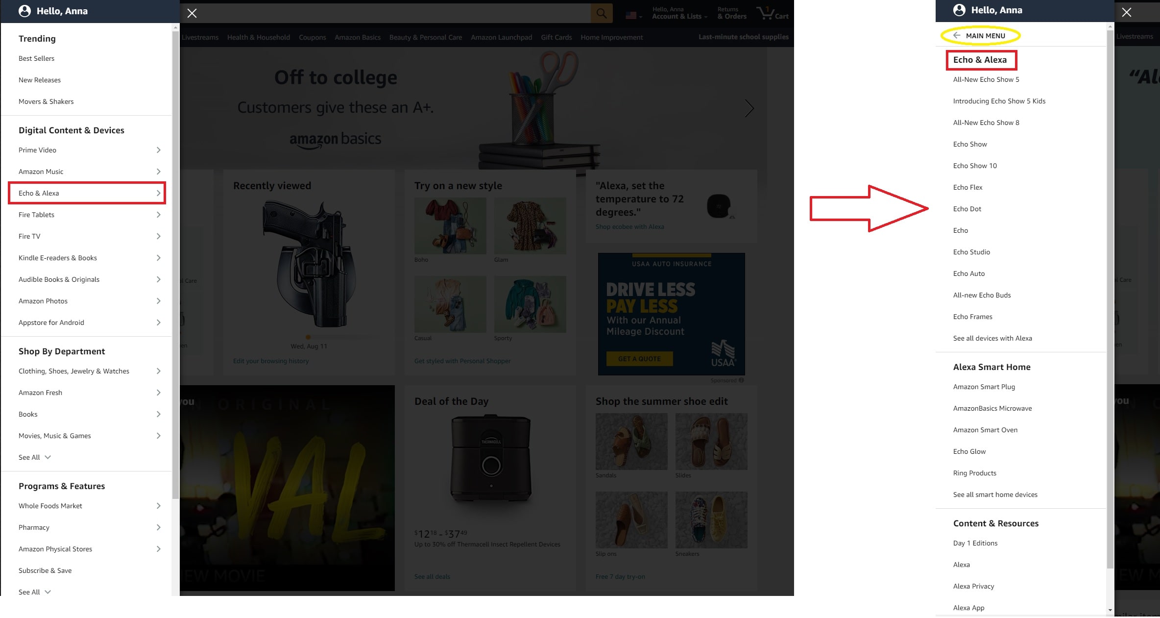
Therefore, designers group menu items into high-level categories instead. These slowly expand as the users select options; the new categories then take users where they want to go.
When creating your UI Design or User Flow, use a combination of different media assets, methods, blocks, components (but don’t forget to keep consistency in mind). Also, my advice would be to make your UI/UX Design appealing by pretending no one would even read the content. Again – we DO judge books by their cover. So make your cover impressive without worrying about the title.
Progressive Disclosure
Progressive disclosure simplifies the baseline experience by hiding details from users until they ask or need to see them. Similar to the nesting dolls, progressive disclosure allows information to be disclosed step by step (concept of Russian nesting dolls).
Good example of this principle in web design is an accordion block (commonly used for FAQs).

Accordion elements can be very helpful when you’re trying to display a lot of information, but only some of the information will be useful to any given person. In other words, only info that users care about right now matters. Info presented to someone who isn’t interested in it is noise.
Related Posts
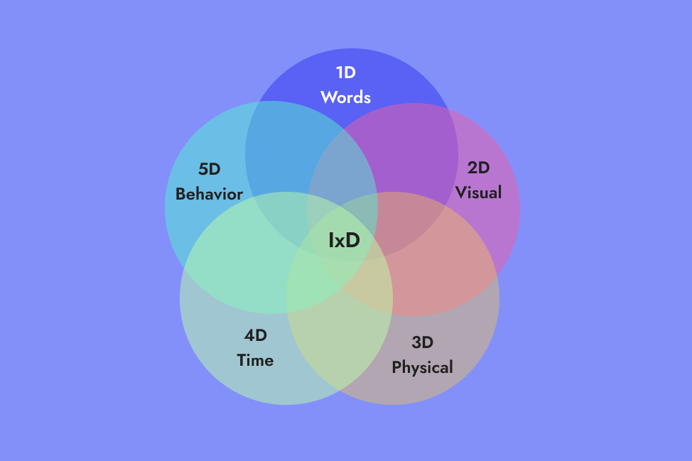
5 Dimensions of IxD explained with CTA example
The concept of 5 Dims of IxD using a very simple example of CTA.

Why I Choose Animated SVGs over GIFs
There are many benefits of using animated SVGs over GIFs, including size,…

Best Practices for Video Embed on the Website
Adding videos to your website will bring some real unmatched value to your site…