

Why We Should Avoid Autoplay Videos in General
In most other cases, the main purpose of placing an autoplay video is advertising. Many publishers get paid for video impressions when the video starts. Video advertising brings the most attention. But why do they become so unwanted even though video messaging is definitely one of the strongest ways to convey the message?
- Even if you can’t see the video right away you can still hear it and, in most cases, it’s very distracting. Even if it’s a contextual video, when people want to watch the video, they can click the play button.
- On mobile devices, it’s not recommended because many data providers charge based on the amount of data consumed, and it affects a user’s bandwidth.
- Autoplay videos not only burn your mobile data plan, but they also burn battery life.
- Nobody seems to like autoplay videos (this article gives you some workarounds to avoid autoplay videos on Facebook, Twitter, Instagram, and Chrome browser in general)
So, is there a reason some videos are still set up in autoplay? The only time we should be doing that is when a specific customer asks for it. I will be talking about this instance down below. It is still important to do it the right way.
Breakpoints between Video and Static Image
There are cases where we want to include actual videos, and not the embeds in our responsive layouts (for example, https://www.manfredicoldstorage.com/)
Breakpoints refer to the viewport sizes at which we make changes to the layout or functionality of a page. Most often these are the smartphone (usually the iPhone at 320px and 480px), the tablet (usually the iPad at 768px and 1024px), and finally large screens at anything above 1024px.
1024px is typically where we transition to static images vs videos since that’s one of the more common upper cut offs for larger tablets in landscape view. And as I mentioned earlier, it’s not a best practice to autoplay videos on mobile/tablet since it depletes bandwidth, etc
Example: https://www.mccollisters.com/
Video autoplays on large screens >1024 px

Video stops and static image appears at 1024 px and below

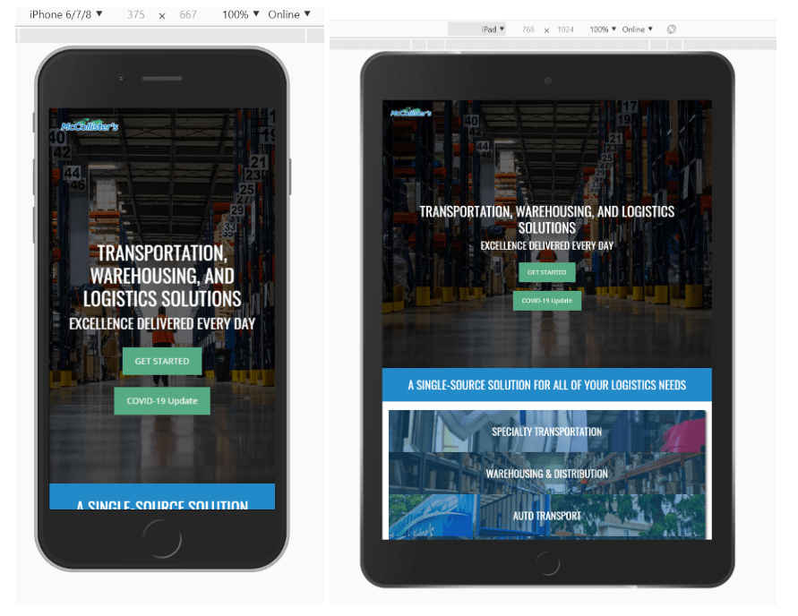
Another interesting way to include a video on mobile and tablet without affecting bandwidth can be seen on this example: https://www.manfredicoldstorage.com/.
The customer liked the hero video so much that they wanted to include it on mobile devices. They were aware of all of the issues that could come up. So we decided to include an iframe embed placed in hero which gives users a choice to either watch it (and make it full screen) or skip it.
Desktop view (autoplay video)

Mobile & Tablet (static image + iframe embed)


Related Posts
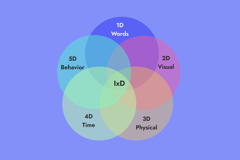
5 Dimensions of IxD explained with CTA example
The concept of 5 Dims of IxD using a very simple example of CTA.


9 Key Principles of “Good to Great” Design
Appropriate UI Design enables visitors to do what they came to do, what they…

Why I Choose Animated SVGs over GIFs
There are many benefits of using animated SVGs over GIFs, including size,…